
When Good Contrast Isn’t Enough
This passes WCAG Contrast Compliance
7.86 : 1
This passes WCAG Contrast Compliance
7.86 : 1
Passing a contrast checker does not always mean a colour combination is comfortable to read. Two colour combinations can have the exact same contrast ratio and still create very different reading experiences.
Same Contrast, Different Experience
Both examples below have a contrast ratio of 7.86:1 and meet WCAG contrast requirements.
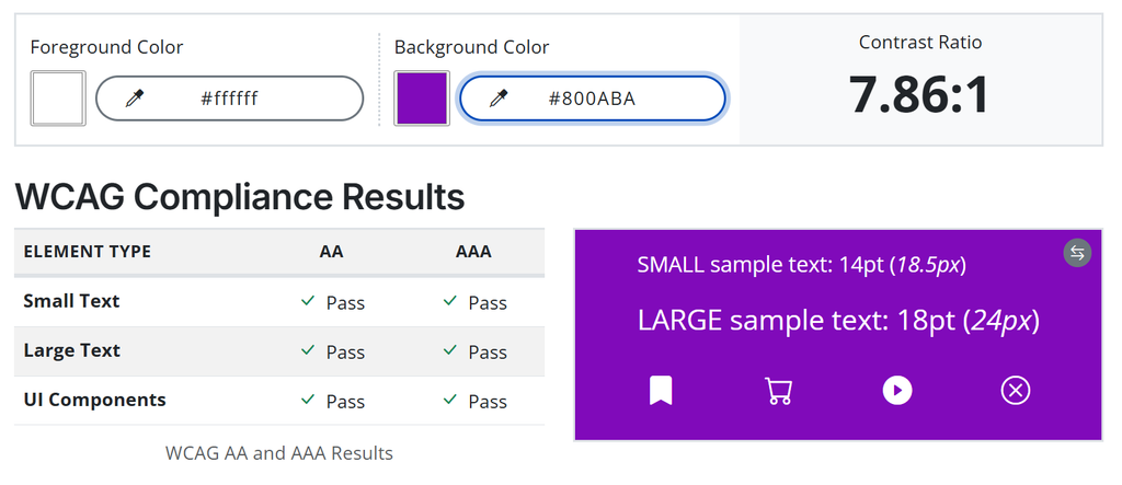
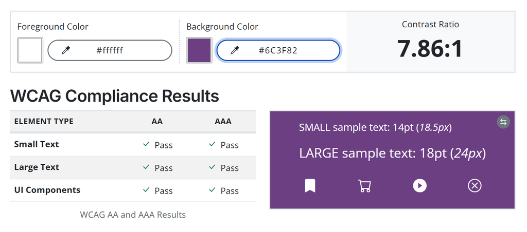
Yet one may feel significantly brighter or more visually intense than the other.
That is because contrast ratio measures the difference between foreground and background colours. It does not fully capture factors such as:
- brightness
- saturation
- colour intensity
- visual sensitivity
- sensory comfort
For people with light sensitivity, visual processing differences, or sensory sensitivities, these factors can significantly affect readability.
Passing WCAG Is Not the Finish Line
Contrast requirements are an important accessibility baseline. But a technically compliant colour combination can still cause eye strain, visual fatigue, difficulty focusing, or discomfort for some users. This is why choosing accessible colours should involve more than simply aiming for the highest contrast ratio possible.
Better Design
When choosing colours for digital content:
- Meet WCAG contrast requirements.
- Avoid assuming that brighter or more intense always means more accessible.
- Consider brightness and saturation as well as contrast.
- Test colours across different screens and lighting conditions.
- Include people with visual and sensory disabilities in usability testing when possible.
The Takeaways
- Contrast tells us whether colours are different enough. It does not tell us whether they are comfortable to look at.
- Accessible design considers both technical requirements and the human experience.
Learn More
W3C: Understanding Contrast (Minimum)
Explains WCAG contrast requirements and how contrast ratios are measured.
Accessible Web: Color Contrast Checker
A free tool for testing foreground and background colour combinations against WCAG contrast requirements.
W3C: Easy Checks, Colour Contrast
Practical guidance on checking colour contrast, including the reminder that brighter, higher-luminance colour combinations are not always more readable for everyone.
Want a Second Set of Eyes?
Accessibility issues are not always obvious, especially when a design technically passes automated checks. The Infinite Mindset can help identify barriers that affect real people using your website.